This topic describes the ribbon user interface present in Merge 2019 and earlier. If you are using Merge 2020 or later, please see Making the Most of the Ribbon.
Background
The ribbon is the strip containing large and small buttons at the top of the Merge application window, just below the window caption bar.
The ribbon makes it easy to discover and use Merge features. Much functionality is made immediately available (often via just one or two clicks), and many ribbon items are labelled, making them quick to identify. Each ribbon button has a tooltip to describe its name and what it does.
The buttons in the ribbon change depending upon the active type of comparison. The ribbon for text comparisons is shown below.
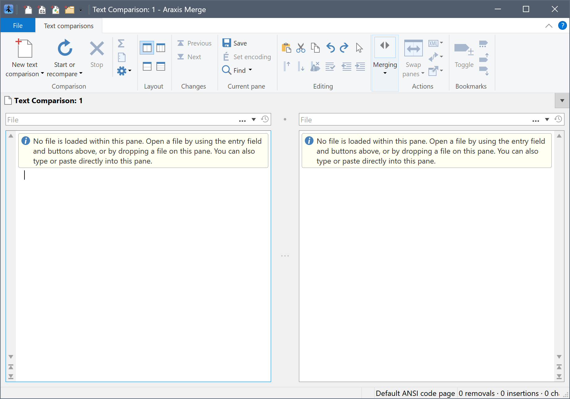
Though not labelled as such on Windows Vista and Windows 7, the dark blue button to the left of the Text comparisons tab is the File menu.
The rest of this topic describes some ribbon features that can help improve your productivity.
Quick access to new comparisons
The main Merge window contains a quick-access toolbar. This contains icons enabling you to create a new text, image, binary or folder comparison with a single mouse click.
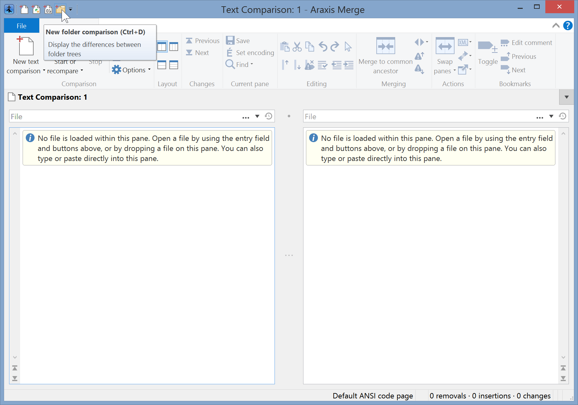
The contents of the ribbon will automatically change to match the type of comparison that you choose.
Ribbon items that are both buttons and drop-down menus
Some ribbon items, like New text comparison ![]() and Find
and Find ![]() in the Text comparisons ribbon tab, are both buttons and drop-down menus.
in the Text comparisons ribbon tab, are both buttons and drop-down menus.
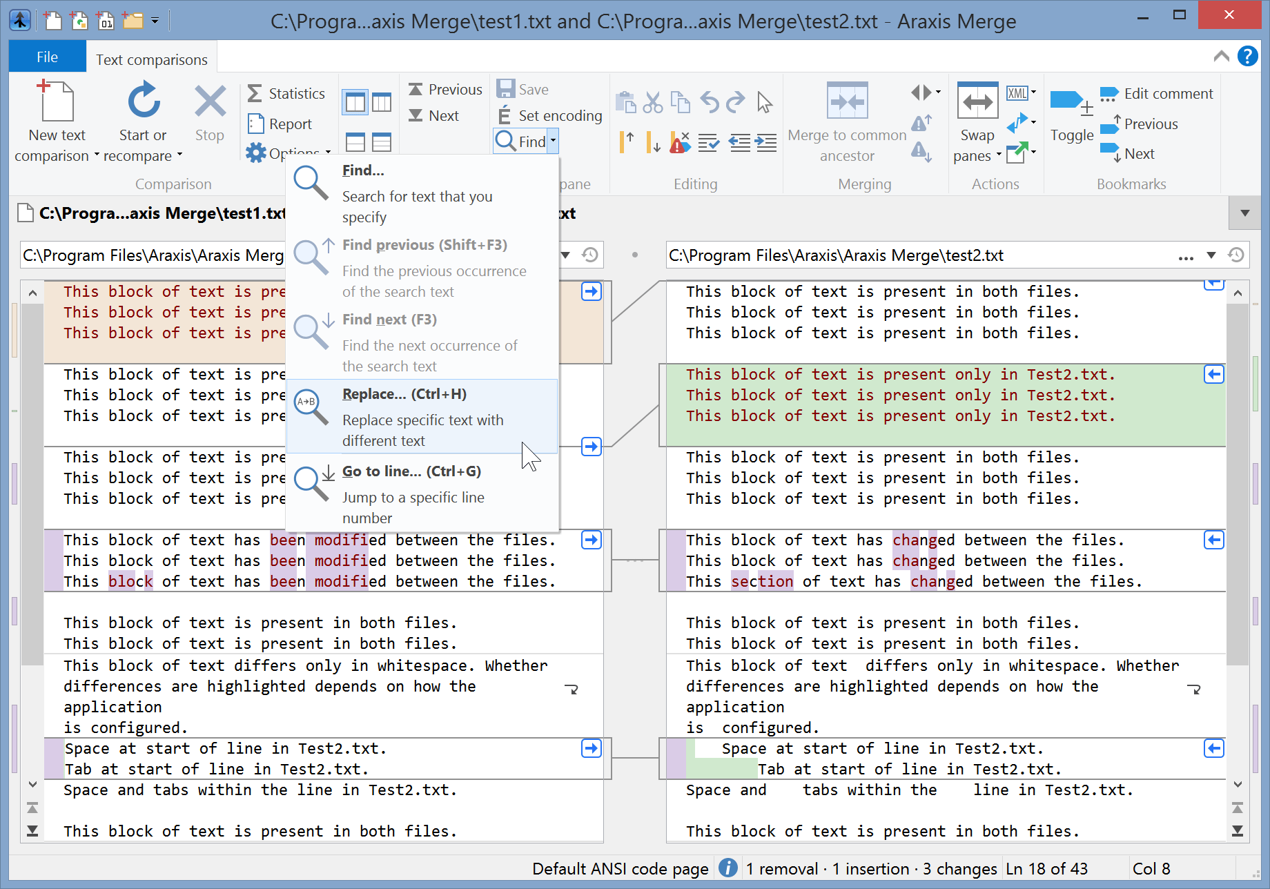
If you click on the icon of such an item, you will perform the action indicated by the text label. If, however, you click on the small downwards-pointing triangle, a menu will appear, enabling you to choose additional actions.
Don’t forget to explore these drop-down menus when you are familiarizing yourself with the Merge ribbon user interface.
The screenshot below shows the drop-down menu associated with the Find ![]() item.
item.
Minimizing the ribbon to save space
The ribbon can be minimized to save space. To do this on Windows 8 and up, use the arrow just to the left of the help icon, towards the top-right corner of the main application window. Otherwise, choose the menu item shown in the screenshot below:
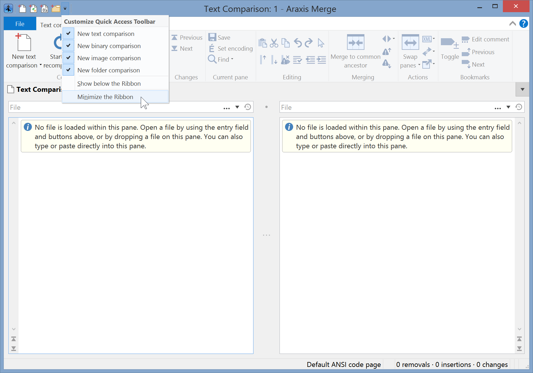
When minimized, the content ribbon is normally hidden. It only appears when you click the ribbon tab names. This is what Merge looks like when the ribbon is minimized:
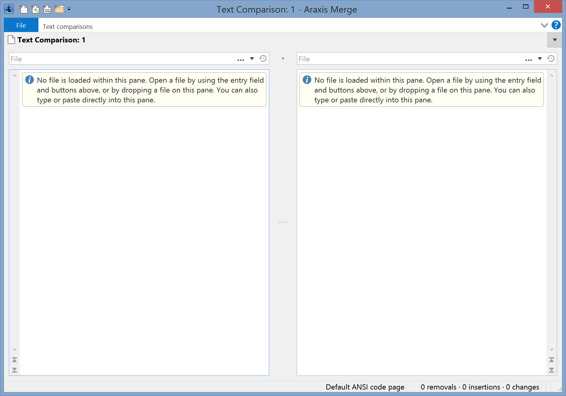
When minimized, the ribbon takes up far less space than the menu and toolbars on Windows XP.
Controlling the ribbon using the keyboard
Merge provides full support for choosing items in the ribbon using only the keyboard. Of course, Merge also continues to support the file and folder comparison keyboard shortcuts (other than those for choosing menu items) that you may already know.
If you consistently use the keyboard for particular operations, you will start to remember the relevant key sequences. Once you have, you will be able to control Merge much more quickly than is possible using just the mouse.
The ribbon makes it very easy to discover the appropriate key sequences. As an example, open the sample text files supplied with Merge in a two-way text comparison (see Comparing Text Files (or Typed/Pasted Text) for how to do this).
Next, press and release the Alt key. The ribbon will now be annotated with the keys that you can press next:
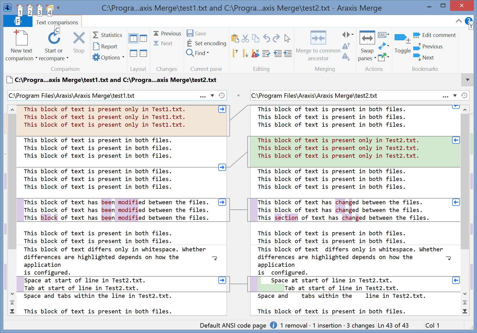
You can immediately see that:
- Pressing the F key will choose the ribbon File menu.
- Pressing the C key will choose the ribbon Text comparisons tab (think ‘C’ for ‘Comparison’).
- Pressing 1, 2, 3 or 4 will create a new text, binary, image or folder comparison, respectively.
- Pressing the Y key will bring up the online help.
Try pressing the C key to choose the Text comparisons tab. All of the controls in that tab are now annotated:

If you press a wrong key, you can press Esc to take back that keystroke.
Some of the controls are annotated with two letters. Press B (for ‘Bookmarks’ – many of the keys are mnemonic). All of the two-letter controls starting with B are now highlighted:
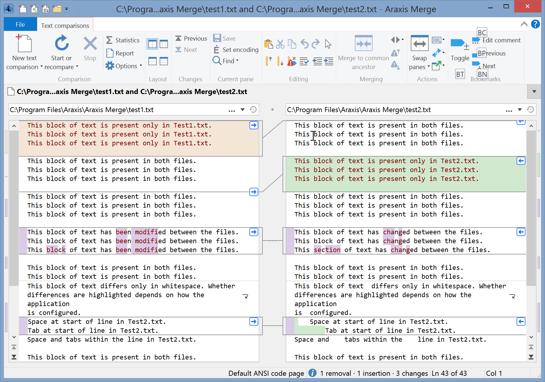
Press the T (for ‘Toggle’). The bookmark Toggle command is activated.
If you already know the first key (C, in this example) that you will press after Alt, you can also press it simultaneously with Alt. For example, you may press Alt+C (i.e. Alt and C at the same time), instead of Alt followed by C. You’d then need to release both Alt and C before typing the remaining keystrokes.
Ribbon adaptation to window width
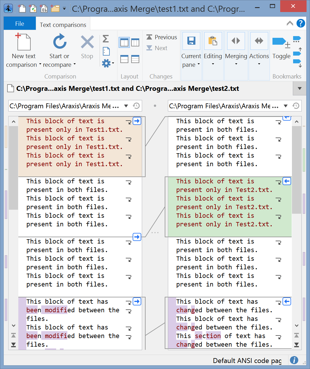
Unlike a toolbar, the ribbon automatically adapts itself to the width of the Merge application window. If the window is wide, then all of the items on the ribbon are labelled, as in the screenshot at the beginning of this topic. If you narrow the window somewhat, some of the labels will disappear:
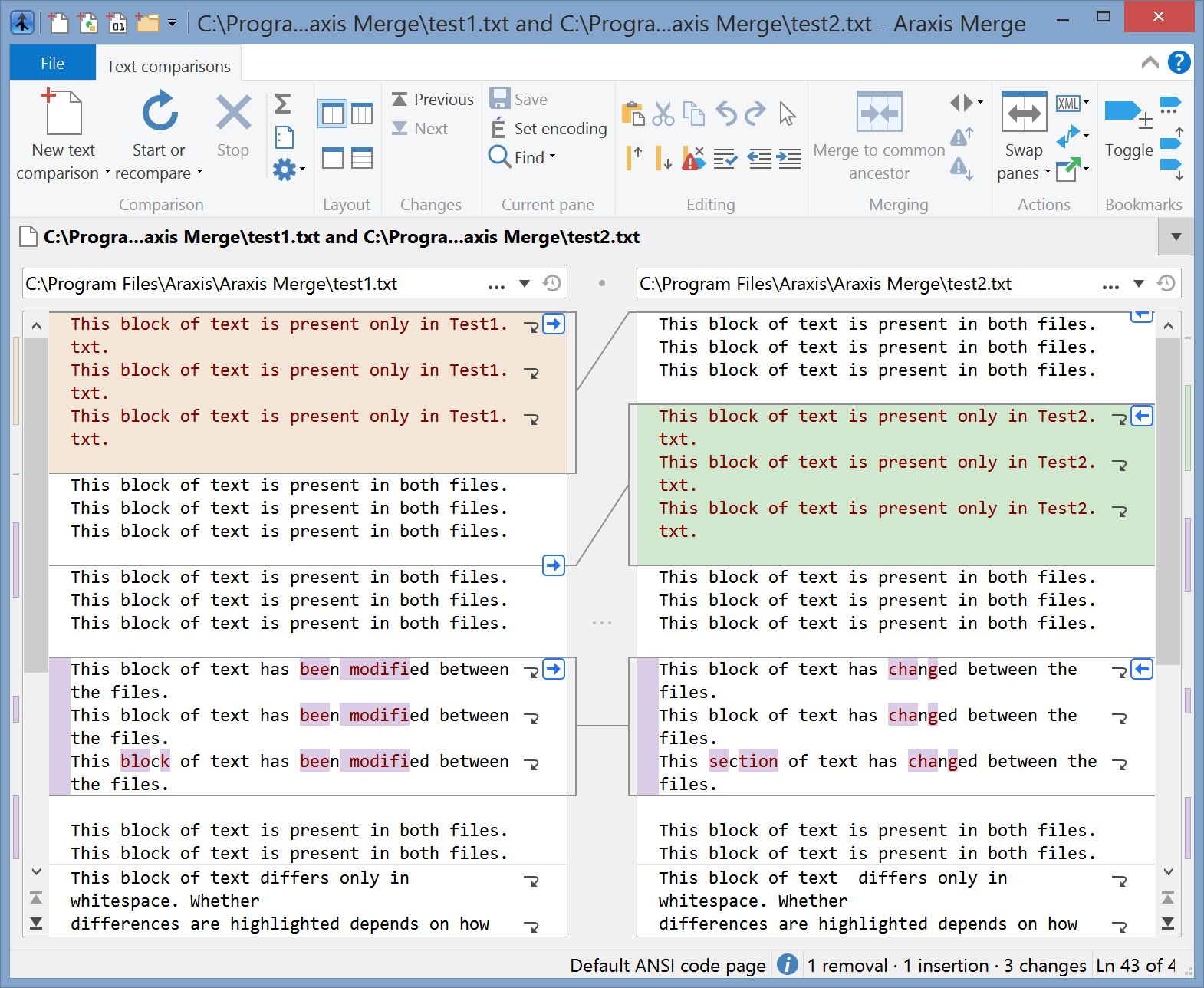
Further narrowing the window will result in some of the ribbon groups turning into pop-up buttons:
The ribbon on the Standard Edition of Merge
All of the screenshots in the Merge documentation show the ribbon of the Professional Edition of Merge. The ribbon of the Standard Edition is similar, except that the Merging group on the Text comparisons and Folder comparisons ribbon tabs does not contain the items relevant only to Merge Professional.