This topic describes the ribbon user interface present in Merge 2020 and later. If you are using Merge 2019 or earlier, please see Making the Most of the Ribbon (Merge 2019 and earlier).
Background
The ribbon is the strip containing large and small buttons at the top of the Merge application window, just below the window caption bar.
The ribbon makes it easy to discover and use Merge features. Much functionality is made immediately available (often via just one or two clicks), and many ribbon items are labelled, making them quick to identify. Each ribbon button has a tooltip to describe its name, what it does, and any associated keyboard shortcut.
The buttons in the ribbon change depending upon the active type of comparison. The ribbon for text comparisons is shown below.
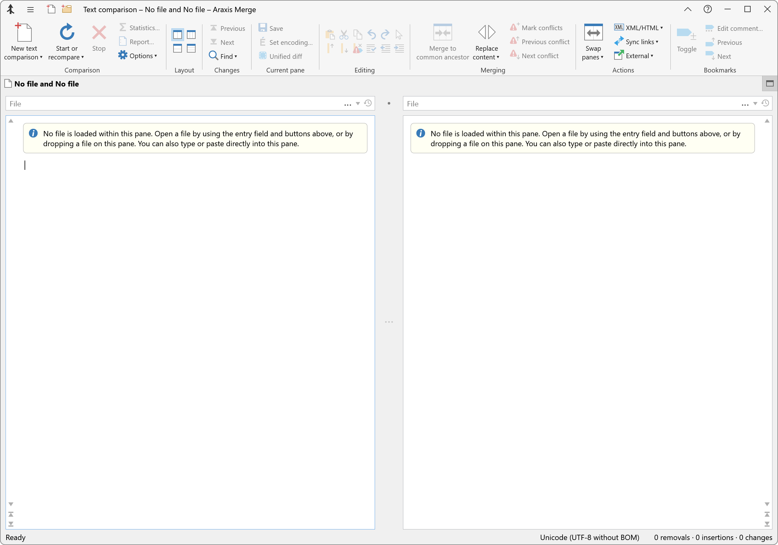
Changes in Merge 2020
Merge 2020 and later feature a new implementation of the ribbon interface. This was required to support the Windows 10 dark theme without using private Windows APIs, but the change has enabled other improvements:
- The new ribbon consumes significantly less vertical space than the old implementation, leaving more room on screen for comparisons.
- The revised design reduces visual clutter.
- Selected items on various dynamically populated ribbon submenus (e.g. the text comparison Options
 ▸Expressions submenu) are now indicated simply using a check mark. The constraints of the old ribbon implementation forced a more convoluted scheme.
The experience of using Merge with the updated ribbon should continue to be familiar for most users. However, please note the following differences:
- The horizontal strip containing the File menu, ribbon tab indicating the comparison type (text, folder, etc.), and help button has been eliminated. This frees its vertical space for use by comparisons.
- The File menu has been relocated to the left of the window caption bar and becomes the Application menu
 .
. - The application-wide Help
 button has been relocated to the right of the window caption bar.
 - The type of the currently active comparison is now shown in the window caption bar, rather than in a tab above the ribbon.
- A new Options…▸Application▸Display▸Show group labels in the ribbon option enables you to hide the text labels underneath each group of buttons in the ribbon. The group labels also hide automatically when the application window is too narrow to show all the ribbon button text.
- Merge 2020.5310 did not provide the capability to minimize the ribbon or to add quick-access commands to the window caption. Both of these features were added in the subsequent release, Merge 2020.5354.
- Although all the File Comparison Keyboard Shortcuts and Folder Comparison Keyboard Shortcuts continue to exist, and ribbon submenus once activated can still be navigated using the keyboard, buttons in the ribbon itself may no longer be selected with Alt-key sequences. Araxis is monitoring how this change affects customers and welcomes comments; please contact Araxis if this reduced keyboard support negatively affects your use of Merge.
Ribbon adaptation to window width
The ribbon automatically adapts itself to the width of the Merge application window. If the window is wide then all of the items on the ribbon are labelled, as in the screenshot above. If you narrow the window, the horizontal labels for the small icons in the ribbon disappear:
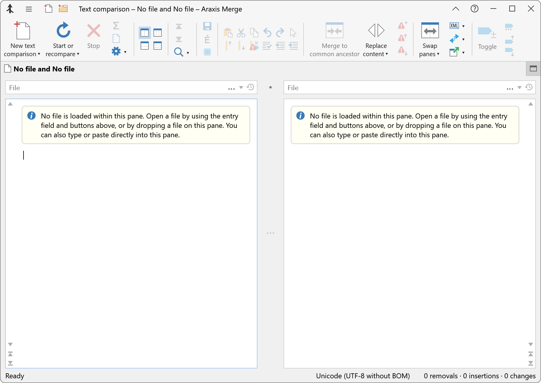
Note too that the text labels underneath each group of buttons in the ribbon also hide automatically when the application window is narrowed. This maximizes the available space for comparisons at smaller window sizes.
The Application menu
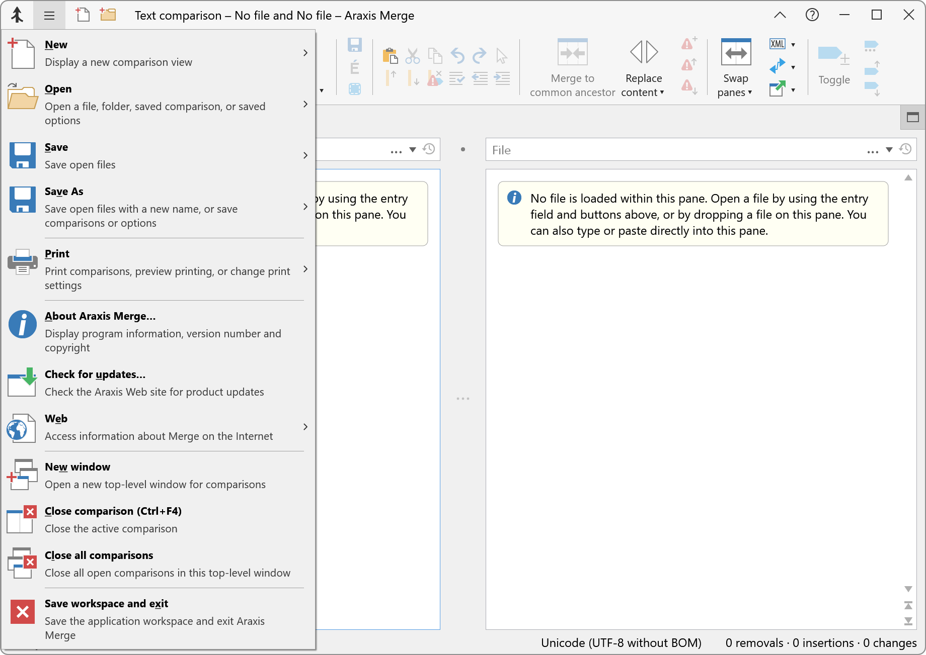
Click the Application menu ![]() button in the window caption bar to display a menu with items relating to the Merge application as well as the current comparison.
button in the window caption bar to display a menu with items relating to the Merge application as well as the current comparison.
Ribbon items that are both buttons and drop-down menus
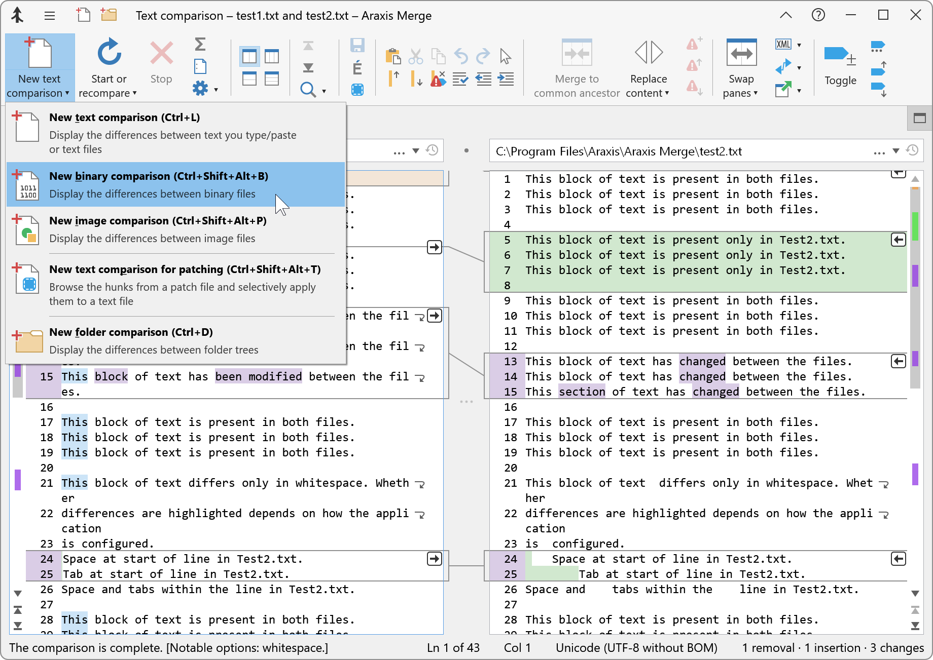
Some ribbon items, like New text comparison ![]() and Start or recompare
and Start or recompare ![]() in the Text comparison ribbon, are both buttons and drop-down menus.
in the Text comparison ribbon, are both buttons and drop-down menus.
If you click the icon of such an item, the action indicated by the text label is performed. However, if you click the small downwards-pointing triangle, a menu appears from which you can choose additional actions.
The screenshot below shows the drop-down menu associated with the New text comparison ![]() item.
item.
Quick-access commands
Icons for quick, single-click access to certain commands can be added to the window caption bar. These appear immediately to the right of the Application menu ![]() .
.
As shown in the screenshots in this topic, New text comparison ![]() and New folder comparison
and New folder comparison ![]() quick-access commands are provided by default. If you frequently use commands from ribbon sub-menus, it can be particularly helpful to add them to the window caption bar as quick-access commands.
quick-access commands are provided by default. If you frequently use commands from ribbon sub-menus, it can be particularly helpful to add them to the window caption bar as quick-access commands.
You can configure which quick-access commands are present in the window caption bar by right-clicking on the ribbon and choosing the Configure quick-access commands… item from the context menu, or by going to the Options…▸Application▸Display page and clicking the Configure quick-access commands… button. For more information, see the Quick-Access Commands topic.
Saving space by turning off group labels
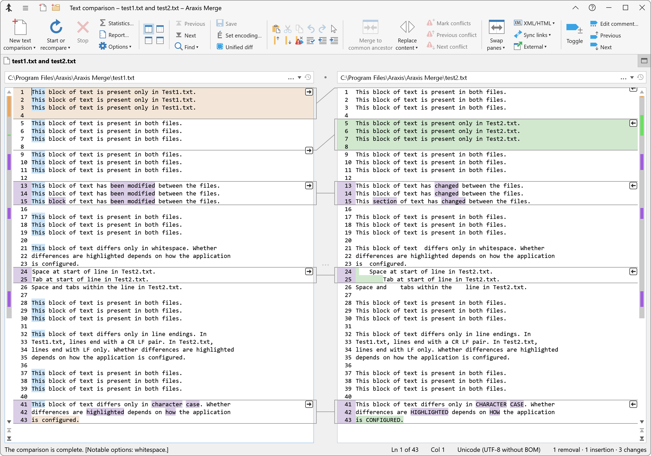
Once you are familiar with Merge, you may find that you no longer need the text labels that appear underneath each group of ribbon buttons. You can do this by unchecking the Options…▸Application▸Display▸Show group labels in the ribbon option. The screenshot below shows a text comparison in a wide window with the group labels turned off.
Saving space by hiding the ribbon
Hiding the ribbon leaves the maximum amount of screen space available for your comparisons.
Click Hide ribbon ![]() in the window caption bar or press Ctrl+F1 to hide the ribbon. Once hidden, click Show ribbon
in the window caption bar or press Ctrl+F1 to hide the ribbon. Once hidden, click Show ribbon ![]() or press Ctrl+F1 to show the ribbon.
or press Ctrl+F1 to show the ribbon.
The ribbon on the Standard Edition of Merge
All of the screenshots in the Merge documentation show the ribbon of the Professional Edition of Merge. The ribbon of the Standard Edition is similar, except that the Merging group on the Text comparisons and Folder comparisons ribbons does not contain the items relevant only to Merge Professional.